
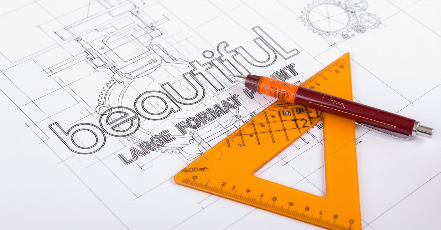

The beauty of space, the power of scale
At Beautiful LFP studio, we don’t just print — we launch your visuals into orbit. From cosmic banners to lunar wall wraps, we engineer large-format prints that defy gravity and expectations. Ground control has never looked this good.
New to the store custom wallpaper – Dock at our online store
Our online store specialises in bespoke wallpaper printing — from seamless one-piece walls to classic paste-up rolls and self-adhesive designs. Bring your vision to life with precision-printed wallpapers in any size or style.
Perfect for feature walls, retail spaces, and home interiors. No fuss. No forms. Just upload your design and order online.

Our missions, logged
From exhibition landings to full retail rollouts, here’s a glimpse of how we’ve helped brands leave an impression that’s out of this world.
Enter


Forbidden Planet


Eastbourne LTA Tennis


Rémy Cointreau
Why print with Beautiful LFP?
Our sustainable practices go beyond just using eco-friendly materials; it’s embedded in our entire process.
The latest technology gives a significant edge
Our passion for printing and embracing the latest technology drives innovation and creativity within our studio.
Your vision,
our sustainable
solutions
Our printing processes use
80% recycled materials and environmentally friendly inks, reducing harmful chemicals
and waste.
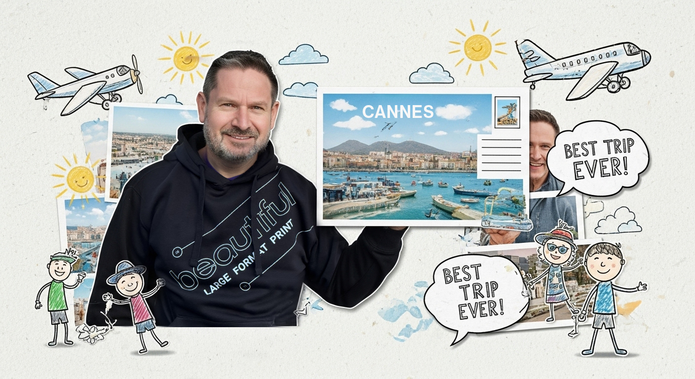
Trusted across the galaxy
These brands chose Beautiful LFP to take their visuals beyond ordinary. So can you.
Ready for lift-off?
Fire up your next print project — we’re standing by at mission control.
Drop us a message and let’s build something Beautiful together.

Broadcasts from basecamp
News, knowledge, and behind-the-scenes dispatches from the Beautiful LFP print lab.


FAQs
We provide a range of services including custom exhibit design, fabrication, installation, and on-site support.
The timeline can vary depending on the complexity of the design, but we typically recommend starting the design process at least six months in advance.
Simply reach out to us via email or phone, and we’ll schedule a consultation to discuss your stand goals, objectives, and budget.
Yes, we offer turnkey solutions that cover everything from concept development to post-event analysis.