

The website became the first expression of that shift. A deliberate nod to 1950s space-age optimism — bold, confident, forward-looking. Space as a symbol of possibility, progress and scale.
The vans were the next step.
From brand idea to moving object
A van wrap isn’t a logo on wheels. At least, it shouldn’t be.
Our vehicles spend their lives on motorways, industrial estates, loading bays, exhibition halls and city centres. They’re seen at speed, at odd angles, in poor light, and often from a distance. That immediately rules out anything subtle, clever-but-quiet, or overly decorative.
The brief wasn’t to replicate the website. It was to translate the thinking behind it.
Why space still made sense
Space stayed as the core reference point, but the execution shifted.
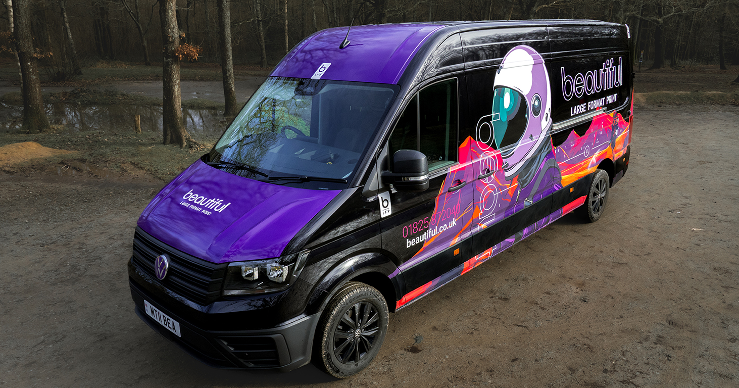
On the website, the 1950s influence is about optimism and exploration — the moment when technology felt exciting, and progress felt inevitable. For the vans, we wanted something more functional. More graphic. More robust. So we moved to a vector-led space environment. Sharp lines. High contrast. Strong silhouettes. Illustration that holds together whether you’re ten metres away or stuck behind it in traffic.
Space, in this context, isn’t nostalgia. It’s scale.
Most of the work we do doesn’t live on screens. It lives in physical environments — exhibitions, retail spaces, events, interiors. Places where size, proportion and presence matter.
Scale is the message
The astronauts on the vans are intentionally oversized. They’re calm, composed, and slightly abstracted. They’re not there to entertain. They’re there to communicate confidence. The landscapes are expansive. The colour palette is unapologetic. The graphics don’t try to explain everything — they signal capability.
If you only take one thing from the wrap as it passes you on the road, it should be this:
We’re comfortable working at scale.
Designed to move, not to be examined
A common mistake with vehicle graphics is designing them as if they’ll be viewed like a poster.
Ours were designed to move.
That’s why the composition wraps around the vehicle rather than sitting neatly between panel lines. Why the typography is bold and restrained. Why the illustration does most of the talking.
It’s also why the messaging is minimal.You don’t need a list of services when you’ve got three seconds of attention. You need memorability.
A practical demonstration of what we do
There’s also a quieter reason this wrap matters.
It’s a real-world demonstration of our own thinking around large format graphics:
• Design that respects viewing distance
• Colour choices that hold under different lighting conditions
• Graphics that work across complex surfaces
• Print and application that stand up to daily use
This isn’t concept work. It’s a working vehicle, wrapped to be seen, used, and judged every day.
Continuity, not repetition
The van wrap isn’t a departure from the rebrand — it’s a continuation of it.
Same underlying idea. Different expression.
The website explores space as inspiration.
The vans use space as a statement.
As with everything we do, the goal wasn’t to shout. It was to be clear.
We’ll be sharing more behind-the-scenes thinking from the rebrand and the work that’s followed — from physical builds to graphic decisions — over the coming months.
Because how things are made, and why they look the way they do, still matters.