
For a long time, we traded under one word: Beautiful. It looked elegant. It felt familiar. It had history. But over time, it became clear that it wasn’t actually saying anything meaningful about who we are or what we do.
On workwear, vans, exhibition floors or signage, “Beautiful” on its own could have meant almost anything. It didn’t communicate that we specialise in large format print to scale, the technical detail behind it, the engineering, or the problem-solving that goes into the work we produce every day. And in environments like exhibition halls, where dozens of companies are working side by side in vast spaces, that lack of clarity started to matter.
We found ourselves needing to explain who we were more often than we should have. Explaining what we do. Explaining why we were there. We needed people to instantly understand who we are, what we do, and the level we operate at. That was the moment we knew something had to change.
For a while, our branding leaned into the idea of being “Simply Beautiful”. It worked at the time and served its purpose. But the business had moved on. What it no longer reflected was the reality of what we had become: a company specialising in large format print, graphics, installations and systems designed to perform at scale. The work had become more technical. The projects more complex. The expectations higher.
We needed a name that was direct, honest and clear. A name that didn’t rely on context or explanation. One that told people exactly what we do the moment they see it.
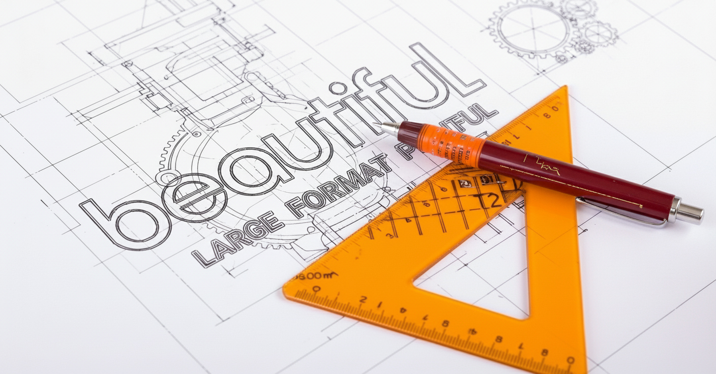
That’s why we chose Beautiful – Large Format Print.
Once that decision was made, everything else started to fall into place. The website. The merchandise. The vehicles. The way we present ourselves on-site and online. It pushed us to look at the business as a whole and ask whether the way we look truly matches the level we operate at. In many cases, it didn’t — and that was an important realisation.
As we explored what “large format” really means to us, one idea kept coming up: space. Filling space properly. Working at scale. Thinking beyond the obvious. Designing and producing work that performs in large, open environments, not just close-up on a screen or sample board. That naturally evolved into the idea of outer space, and from there the astronaut persona became part of the brand.
The astronaut gave us a way to talk about scale, exploration and precision without taking ourselves too seriously. It became a metaphor for how we approach our work — pushing further, thinking bigger, and operating confidently in challenging environments.
We chose a retro-futuristic style deliberately. Technology moves fast and dates quickly, especially in print and digital design. Trends come and go. We wanted something that felt timeless rather than trendy — something playful but serious, distinctive without being gimmicky. A visual language that would still feel relevant years from now, not something that would need reinventing every time design fashion shifts.
What hasn’t changed is the way we work.
It’s still the same people, the same standards, and the same focus on quality and reliability. We’re still the team who fix problems before clients even see them, who care about the details, and who take pride in delivering work that performs as well as it looks.
What has changed is clarity.
The new identity reflects the business we are today and supports where we’re heading next, including the launch of our new e-commerce platform. It helps people understand us faster, sets expectations more accurately, and sets the tone for how we want to be experienced going forward.
This rebrand isn’t a reinvention. It’s an alignment.
Beautiful has always been about making things look exceptional. Now, finally, our brand does the same.